
I realize that today might have limited appeal. But there may be those who find it helpful. This is a personal review of two of the new Roman Missals recently printed and put to the test.

The above book is from LTP. It was our first choice back when we were only given a sample page or two from each of the companies. I like very much that they used original art with a certain amount of symbolism involved and a vast step above the Playschool symbols to which we have been subjected over the past years. The cover of the book looks noble, the paper was glare free and for the most part easy to read and follow.
However, as you can see above, the gold on the cover is severely worn off after just three weeks of use. Below is a book that has been in hard use for three years and the cover, for the most part, is still in decent condition. I found this very disappointing. The book also does not lay flat and worst of all, the tabs meant for easy navigation of the book during the Mass are placed such that when one uses them to flip to the section that one desires, there is then need to flip BACK one page. But not all of the time. That is an annoyance and an inconsistency that prompted me to try another company.

Below is the Catholic Book Publishers who did the above book. I found the above book to be of the highest quality but lacked much (to my mind) in the way of beauty (which was why I originally went with LTP.) I used the new one for the first time this morning at the school Mass. The servers were present at the unwrapping and immediately liked it for various reasons.
For personal taste reasons I am not excited about the artwork on the cover though it does symbolize well what the book is about. The tabs are much better placed and take you directly to where you need to go without any additional flipping.
I've heard some guys complaining about the fancy first letter of each section but I like it. If I should look away for a moment my eyes comes right back to where I need to be and it is due to the letters giving me a reference spot.
It is well laid out and there is no glare on the pages. The font is easy to read. I am not over excited about the artwork but it could be far, far worse.

Below the CBP and LTP are placed side by side respectfully. Notice that the LTP pages come all the way down almost to the edge of the cover. This makes for the pages to be more easily damaged and indeed they were damaged in shipping even before we got our hands on it. An edge also makes it easier for the severs to hold. There is also the nice gold design on the inside edge that made the servers this morning ooh and ahh.
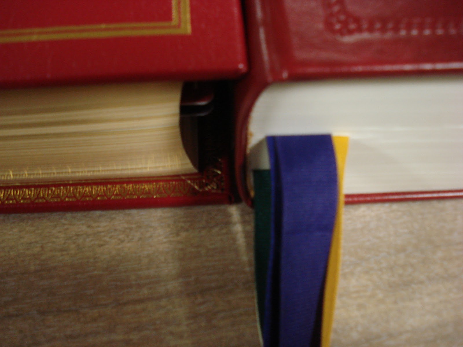
It is difficult to tell from the below picture but the LTP ribbons are quite thin compared to the amount of pages that they are required to turn causing them to slip out more easily than the broader ribbons in the CBP.
Below is a memorial Missal which we will use only a very special occasions. It was given in memory of one of our parishioners by her friends. (It was very expensive.) It was put out by the Midwest Theological Forum. They also put out less expensive volumes. We have an all Latin text from them donated by Fr. M. in our chapel that they produced. The bindings seems very good, the books lay flat, the have broad ribbons, the text, paper, and lay out make them easier to read. The book has a noble simplicity about it and it has a goodly amount of space from the edge of the cover to where the pages begin.

If I had one complaint it would be that, although I very much like the art work and appreciate what they used, if I had my druthers I wish they would have used some current artists who are producing (IMHO) good liturgical art in order to support our artists and encourage new Catholic art to be produced.

4 comments:
Fascinating comments on the new Roman Missals! It was difficult deciding which ones to carry in our catalog, with very little to go on and very little lead time between previews and sales... We opted to have one contemporary style (LitPress), one traditional (Magnificat) and one awesome (MTF). I wanted to like the LTP version but after one of our priests referred to the illustrations as 'coloring book art' we decided he was right; it was a nice idea to have current traditional style art, but it just wasn't the quality it should have been. The LitPress was a good buy for the contemporary art crowd as was the Magnificat for the traditionalists. And everybody loved the MTF version!
Our decisions were based on paper quality, binding, artwork, etc. We are just now beginning to hear some practical feedback such as yours on the tabs, readability, etc. Very helpful report from the trenches, thanks!
who is Annie Dixon?
Who is Anonymous?
As for the previous question, see www.anniedixon.com
and/or www.dixoncatalog.com
:)
The CBP that you show here looks like the one our parish uses. Our priest really likes it.
Post a Comment